Is there anything more horrifying to a marketer than the threat of being irrelevant? We’ve heard time and time again that visuals are a surefire way to miraculously bring in traffic, raise conversion rates, and increase social media engagement, but what happens when the visuals you’re using are considered passé? That question is particularly relevant of infographics, the popular visual representations of data loved and hated by brands and companies worldwide.
While many love the way these graphics present data, there are many others declaring the infographic dead, irrelevant, and outdated. The argument is especially conflicting because, as we have found ourselves, infographics can really go either way. It would be slightly hypocritical of us to lament the infographic when we’ve had such great success with ones such as our Game of Thrones themed “Social Media Winter is Coming.” With this in mind, we’ve taken a look at the two sides of the debate and rounded up the most widely echoed arguments for each. Make sure you chime in and let us know what side you’re on!
The Bad
Back to the future
How many marketing strategies can trace their origins to over 32,000 years ago? The infographic saw its humble beginnings in 30,000 B.C. with cave paintings depicting animals and building resources, and many argue that these visual representations of data haven’t evolved much since. While the Internet has definitely changed the overall feel of the infographic and the number of hipster typefaces being used, they are still essentially created as a way to take a “large amount of information in text or numerical form and then condense it into a combination of images and text.”
The Head of Behance Community Data & Insights, Sarah Rapp backed this up when speaking to FastCompany, saying: “Infographic posting generally rose steadily from 2007 to 2012, where it peaked, and has begun to decline since then.”
What’s more, is that due to its original novelty wearing off, the infographic has proven to be less and less effective for driving traffic to websites. Neil Patel of KISSMetrics and Quicksprout shared that from 2010 to 2012, he saw a 99.14 percent decline in visitors linking to the site thanks to infographics. If you’re worried about being outdated, overdone, or sharing tired marketing techniques, you may want to carefully consider the infographic.
What do you mean?
The original purpose of the infographic was to, well, inform. Since the incredible popularity of the format took off, however, it seems the “info” portion has taken a backseat to the desire to go viral through the use of a trendy tactic. In most cases, there is a clearer way of sharing information than an infographic. If you do choose to make an infographic, consider whether it is causing more confusion or making your audience raise more questions than those being answered. It’s always a great idea to carefully consider your purpose when approaching your marketing efforts. Why are you sharing this? How does it fit into your overall plan? If you can’t easily answer these questions, it might be time to get back to the drawing board.
Making content for the sake of making content is a poor strategy, with every piece of your content plan playing an important part in your overall vision. If your idea or information is difficult to share simply through text, an infographic may be a viable option, but if you are just throwing together some random facts for the sake of creating a pretty and shareable graphic, you are running a misguided campaign.
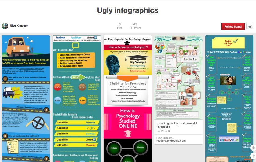
Not pretty
While the main draw of an infographic is the aesthetic value, the number of poorly designed, hideous ones out there is truly mind-boggling (a simple search of “bad infographics” brings up thousands of results). As the creators of “Information is Beautiful” know, beautifully “designed information can help us understand the world, cut through BS and reveal the hidden connections, patterns, and stories underneath.” With good design having this immense power, a badly designed infographic is a definite shame. No matter how sharp your information or data is, if your infographic is visually nauseating or confusing, you are doing you and your brand a great disservice.
To avoid this when you believe your infographic is worth creating, it is important to design around the data, rather than the other way around. Lists are not infographics, maps are not infographics, and graphs are not infographics. With this in mind, it’s also important to note that with 50 percent of the web’s traffic coming from tablets and smartphones, an infographic created in 2015 needs to be designed for mobile viewing. Tiny figures and text won’t cut it on an smartphone screen if you want your audience to actually get value from your content. Design can make or break an infographic, so tread gently when tempted by risky or obnoxious visual choices.
Do not do you
Nobody likes someone who only talks about themselves, and this goes for brands too. If you are just making an infographic to self-promote or share information that is only relevant to your company or organization, here’s a harsh truth: nobody cares. Many infographics simply act as an advertisement for a brand, without any consideration for what those consuming the content are actually interested in reading. What are the biggest problems your audience is facing? If some of these questions can be answered through an infographic, it won’t be a loss.
Like any social media or content strategy, the audience is the most important factor. As long as your infographic shares information that your audience actually cares about, you won’t be committing a crime against marketing.
The Good
Visual healing
With the human attention span now less than that of a goldfish, visual marketing is a logical way to grab your audience’s attention. Because brains process visuals 60,000 times quicker than they do text, infographics can be a way to take advantage of this evolutionary trait. Good visuals are just simply easier to process. As Social Media Today explains, “On average, it takes 50 seconds to read 200-250 words but only 1/10 of a second to process a visual scene.”
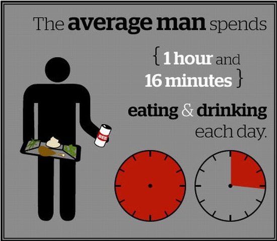
However, the key here is quality. As mentioned above, bad infographic design is disastrous to your marketing plan. For a more detailed look at how our brains process the visual components of infographics, Visually shared a fascinating study with Dr. Ruth Rosenholtz, the Principal Research Scientist at the Department of Brain and Cognitive Sciences at MIT. Teamed up with Rosenholtz, they evaluated three infographics and provided feedback on bad, mediocre, and good infographic design.

Sharing is caring
The popularity of infographics didn’t come out of nowhere, and shareability had much to do with this. Due to their visual nature, good infographics are perfect for sharing across social media sites. Visually shares: “Whether you’re after likes, shares, or +1s, infographics have great virality. For example, Tweets with images receive 18 percent more clicks, 89 percent more favorites and 150 percent more retweets.” Pinterest is another site that is infographic heavy due to its highly image-based content.
To maximize the shareability of your infographic, Piktochart provides the following tips:
-
Create smaller infographics that are easier to share via social media and mobile.
-
Break up multiple topics into small infographic chunks.
-
Daisy-chain your infographic chunks (create a series of relevant and related infographics)
-
Make each infographic a tease and a promise.
-
Use compelling images with the power to stop your audience in their tracks.
Traffic jam
Thanks to their highly shareable nature, valuable infographics have the power to bring traffic to your website as well as to your other social media channels. Providing your customers and followers something they can share easily will not only raise awareness of your brand, but bring traffic and visitors to your website. As Neil Patel at Quicksprout explains, “if it weren’t for infographics, I would have never generated links from sites like Forbes and Huffington Post. Sure, these links may not help boost your rankings as much as they did in the past, but they still drive qualified traffic to your site.” Adding to this, Visually says that “publishers who use infographics grow traffic 12 percent faster than those who don’t.”
As a way of supporting your inbound content marketing strategy, infographics are a component to carefully consider. As long as your infographic is compelling, useful, and aesthetically pleasing, it can be a positive addition to your overall objectives.